Case Study / Crunchafi Rebrand and Design System
Role
Project lead / Senior principal product designer
Scope
Rebrand integration, Dual-product UI Refresh, Unified Design System Development
Phases
1 / Understand
2 / Ideate
3 / Design
4 / Implement
1 / Understand
The first step in our process was to align around a user-centered understanding of the problem, informed by research, interviews, and behavioral observation. My role as UX lead was to facilitate this discovery across disciplines—product, design, engineering, and marketing—while grounding our work in real user needs.
Key challenges emerged:
A Steep Learning Curve for Non-Accountant Users
Originally designed by accountants for accountants, the existing UI relied heavily on domain-specific jargon and lacked clear visual hierarchy. Usability testing revealed this created barriers for non-accountant users—the very people responsible for daily operational use—leading to frustration, slow onboarding, and diminished perceived usability. Our findings echoed the aesthetic-usability effect, wherein outdated design led users to undervalue the product’s capabilities.
Lost Sales Tied to Interface Perception
Through sales feedback and customer interviews, we identified that several prospective clients cited the outdated UI as a key reason for not moving forward. Despite robust features, the interface conveyed a lack of innovation and professionalism, directly impacting purchasing decisions.Inconsistency Across the Product Suite
Although both LeaseCrunch and StrongBox shared a Bootstrap 5 foundation, they diverged significantly in visual design and user experience. This misalignment undermined efforts to position the offerings as a unified suite and risked confusion for users transitioning between them. With additional product acquisitions on the horizon, this inconsistency posed a growing risk.A Rebrand as a Strategic Opportunity
A company-wide rebrand—led by the marketing team and tied to a firm launch date—provided a catalyst for change. This created a clear, time-bound opportunity to deliver high-impact improvements that aligned both products under a modern, cohesive design direction.
2 / Ideate
Our ideation process combined divergent thinking with structured collaboration. We engaged cross-functional stakeholders early and encouraged broad exploration, guided by clearly defined user needs.
Key solution directions included:
Refined Visual Hierarchy & Language
We re-evaluated page structure with empathy for non-accountant users, introducing contextual subtext, simplifying complex terms where appropriate, and preserving necessary financial language for accuracy and trust.
UI Refresh Anchored in the New Brand
We applied the updated branding across both products, elevating the visual aesthetic to reinforce usability and enhance first impressions—without disrupting existing user flows.Shared Component Library Across Products
We reimagined our design system from the ground up, building flexible components that could adapt to both product contexts. This included theming support (e.g., color modes) to maintain subtle brand distinctions while promoting consistency.
-

Before
Excessive use of color, icons, and dense text—without a clear hierarchy—created cognitive overload for new and non-accountant users, obscuring key actions and workflows.
-

After
We reduced visual noise and clarified intent by grouping lease revision actions by accounting impact, with each option supported by concise, contextual guidance.
3 / Design
As principal and project lead, I was responsible for ensuring design consistency across teams while allowing individual designers to own execution for each product. I centralized the design system effort while enabling collaborative governance to ensure system-wide adoption.
Throughout this phase, we balanced innovation with pragmatism—respecting user expectations and product constraints while elevating the interface to match the brand’s new positioning.
Lease Accounting Product Redesign
I owned the design and design process of this product in coordination with direct coordination from the design system co-lead to integrate shared components and new brand elements.
Data Extraction Product Redesign
Similarly, design owned by a senior product designer with emphasis on consistency in layout, tone, and component behavior.Crunch Design System
Developed in Figma, the design system served as the foundation for both products. Components were documented, responsive, and systematically tokenized to support implementation in code. We prioritized abstraction, accessibility, and maintainability.
Crunch /
design system
-

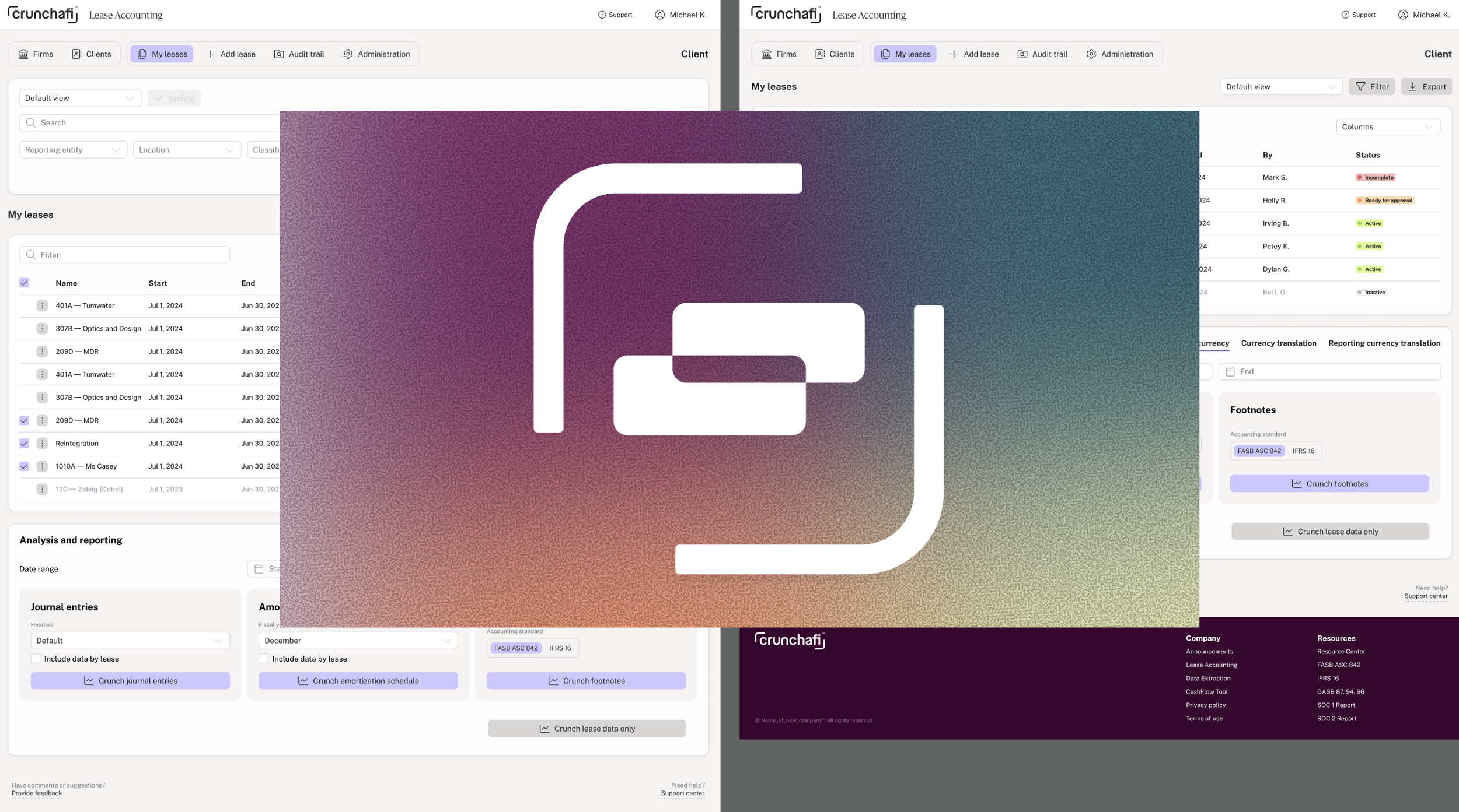
Lease Accounting
Lease Accounting, with a refreshed UI featuring the new design system and common Chrunchafi design language.
-

Data Extraction
Data Extraction was an acquired product that was visually transformed into a cohesive Crunchafi product.
-

Common Componts
Using Bootstrap 5 as our operating UI framework, we developed component blocks that serve both products for their building brand unity.
Prototype
4 / Implement
I partnered closely with product and engineering to translate designs into actionable work within our Agile Scrum framework.
This included:
Authoring Design Specs & Stories
I created detailed tickets with user stories, acceptance criteria, annotated visuals, and design rationale to ensure engineering clarity and shared understanding.Bridging Design and Development
We established a handoff process that connected Figma components to SCSS tokens using JSON exports, fully compatible with our Bootstrap 5 foundation. This streamlined the translation of color, typography, and spacing into front-end code.Coordinating Launch with Marketing
While the marketing team had not expected product changes to align with the rebrand, we strategically timed the UI updates to coincide with their outbound brand launch. This strengthened the market message and minimized customer confusion—turning what could have been a visual disconnect into a seamless brand experience.

The initiative resulted in a unified product suite with a modern, user-friendly interface backed by a scalable design system.
New users experienced improved onboarding, sales conversations gained credibility, and engineering teams adopted a more efficient and reusable approach to UI implementation.
By leading this effort across two products and a brand system, I helped position the company for future growth—setting the stage for smoother integrations of future acquisitions and a more confident, cohesive user experience.